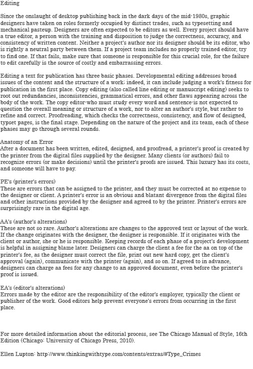
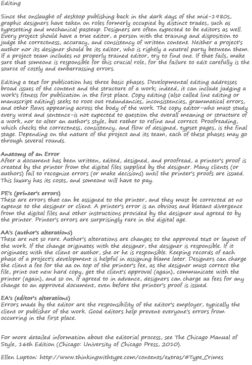
Or should it be “for”? I never understood why conjunctions and prepositions etc. aren’t capitalized in titles. Speaking of typographic decisions (seriously, I didn’t even plan that connection), the latest in-class exercise had us practice some typesetting. This is very unfamiliar territory – I mean, the kind of unfamiliar you’d get if stranded on a desert island and lost in the jungle. Invited-to-tea-with-the-Dalai Lama unfamiliar.
The Task: Take some sample copy, and format it according to certain typographic requirements.
Part A – measure: 4 inches, justified text, black/dark typographic colour.
Part B – measure: 4 inches, flush left alignment with a right ragged edge, grey typographic colour.
Part C – your choice, break as many typographic rules as possible.
Oh, and use typefaces from the same family for parts A and B.
The Problem: What is a measure? Apparently, nobody knows. Not even Adobe Help.
The Strategy: Fake it ’til I make it.
The Results:
I used Century Gothic for part A, and Century for part B. So not the same type family.
Attempt #2:
This time I used Segoe Script for part A, and Segoe Print for part B. Still not entirely sure they qualify, but at least both are sans-serif this time. On to the best part: breaking rules.
I think it’s still too legible. But at least I got to have a bit of fun.
Broken Rules:
1. Colour – green is terrible for legibility, and studies have proven black text on a white page is the most effective combination.
2. Leading – in this case, negative leading. Without the right amount of space between baselines, the reader either takes in too many lines at once, or has difficulty locating the next line.
3. Sentence Case – because this is in ALL CAPS, it is harder for the eye to travel across the page, thus inhibiting the reader.
4. Typeface – I used “Pythia”, a very Greek-looking typeface which falls under decorative classification and is inappropriate for body copy (i.e. unreadable).
5. Justification – fully justified here, often leads to “rivers” in the text (white space) and leaves gaps between words making it hard to read.
5b. Hyphenating – a technique found in full justification to avoid such “rivers”, but mak-
es it difficult to follow the text, causing the reader to pause between lines.
6. Kerning – again, negative. If letters are too close together or even overlapping, the text is not defined and does not succeed in communicating a legible message.
I think that’s everything. If you ever see someone produce copy text like this, throw it out. Or better yet, rip it into pieces, and then put those pieces through a shredder.


Witty, interesting and informative as always.
@5b. I see what you did there 😉